Design Document
Want to see how I kept everyone on the same page as the game evolved? Look no further!
SPOILER ALERT
Do not continue if you haven't already played the game. There will be spoilers.
Concept
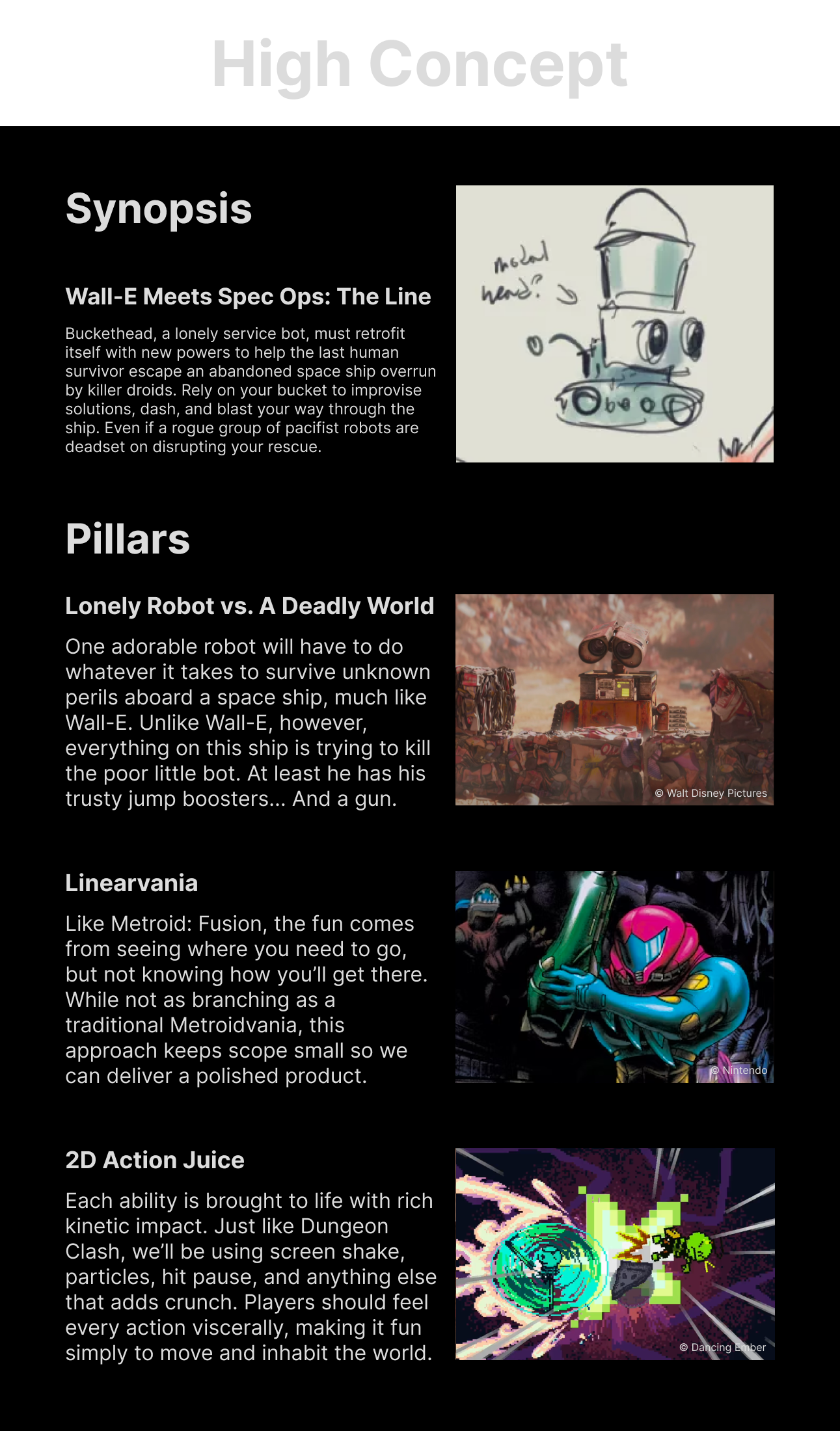
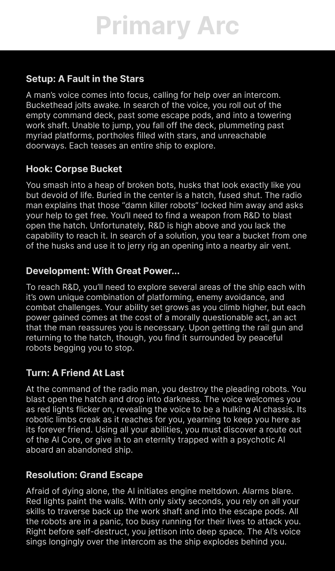
To recruit talent, I needed something flashy and compelling I could show people. By starting with a solid concept that captures interest, I was able to inspire imaginations, and get people interested in collaborating. Additionally, it keeps everyone onboard with the high level vision for the game.
Abilities
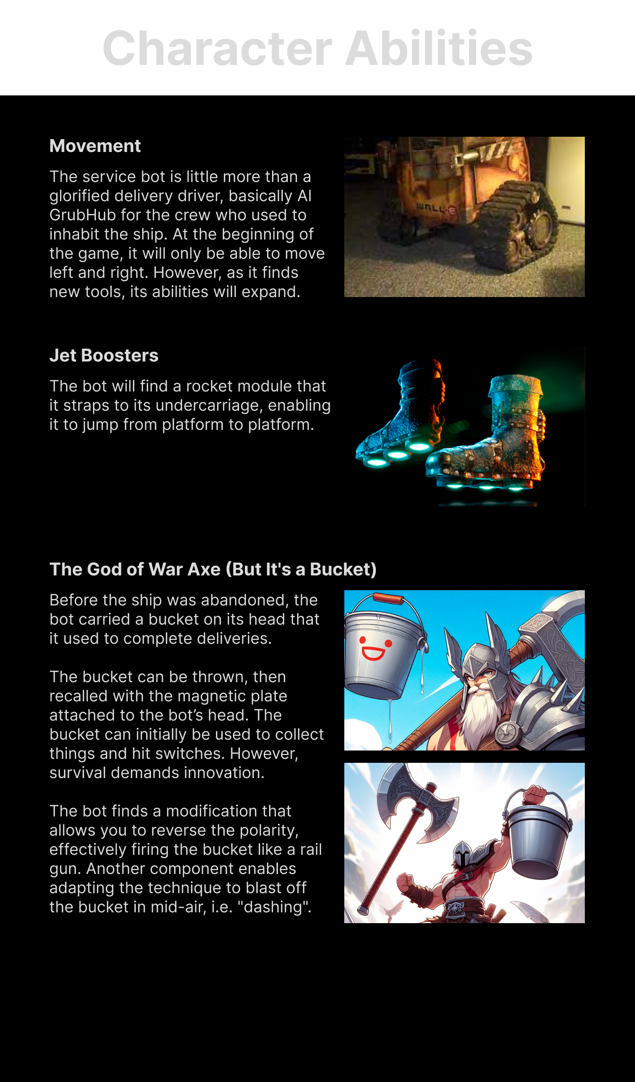
To get the team onboard with an idea, I'd start by drafting a visually pleasing document that spells out the ability in a compelling fashion. After HillE came up with the BucketHead concept art, I knew we had to build the game entirely around that as a mechanic. The opportunity was too good. Here's how I drafted that out to get buy in from the team.
Programming Tech Doc
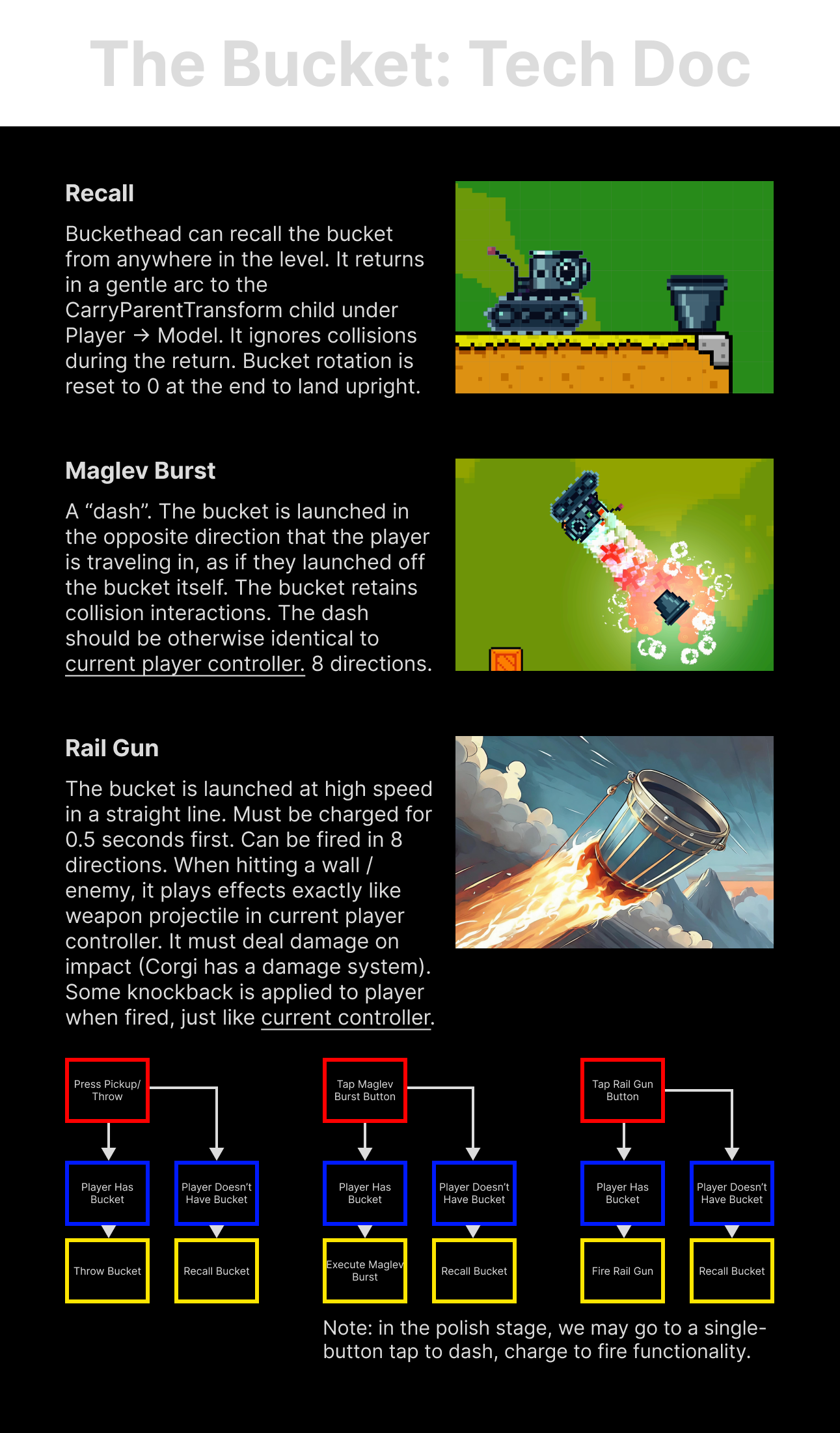
To improve efficiency, I prefer to create individual design documents per department and tailored to their requests. This saves time on paperwork, but also gets teammates the information they actually need without having to spend time scouring a giant document. And let's face it, no one reads these things otherwise. To help Eeni14 envision how the ability code would work, here's how I laid out functionality. Notice that this document is not particularly compelling from a writing standpoint because it's geared towards understanding technical requirements and details. Each section of the design doc was tailored towards it's intended audience and purpose for maximum clarity.
Art Tech Doc
My artist also needed to understand the dimensions of the world they were working in. That's the purpose of this document. I also included descriptions of technical terms in case my artists weren't familiar, as they may be less used to working at the technical level.

Level Design Overview
I split level design documentation into numerous sections, again tailored to each department. This first section laid out the broad overview for the game space so anyone could understand what we were doing at a glance.

LD Principles
Before designing any levels, I spent time compiling a list of core tenets from Metroidvanias. This ensures that I fully understand the genre I'm working in, the tropes, and the expectations of my audience so I can design something relevant to them. It also gives me criteria to measure against as I'm developing any particular area.

Macro Layout
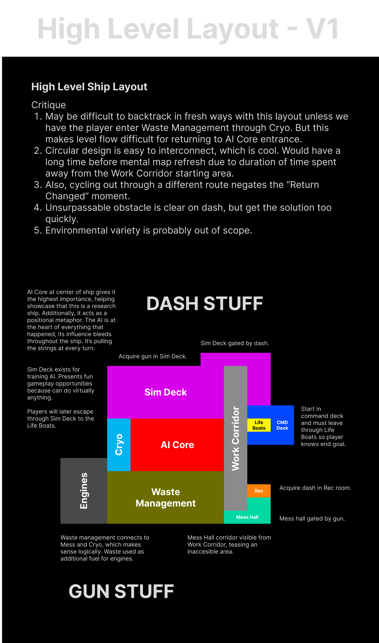
With my principles in mind, I drafted numerous layouts (both on paper and digital). I started with spatial relationships to make sure the world felt justified, which helps create a stronger sense of place. You'll notice that I also listed out a series of critiques (based on the principles I'd laid out earlier).
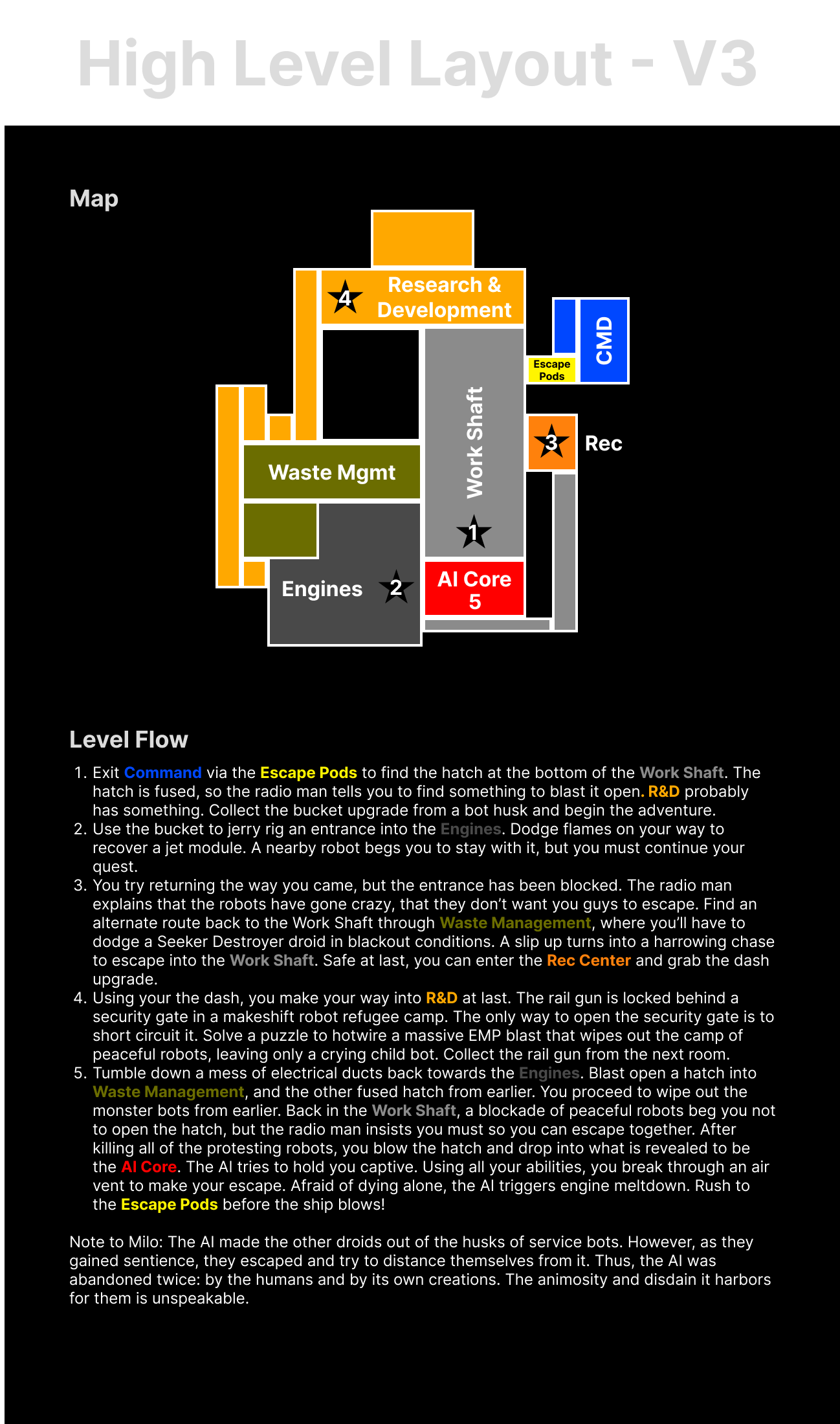
With everything I'd learned from the first digital draft, I set out to create the actual layout we'd use in the final product. This one also included a concrete level flow that describes the kinds of gameplay the player would encounter in each area. Unique gameplay elements contribute to each area's identity and lead to more dynamic pacing, so it was important for me to make sure I was keeping things varied. Plus, it's easier to iterate in text before trying to implement in-engine.
Blockout
After doing numerous level drafts on paper, I'd use nondescript tilesets in-engine to execute on the idea. Over the course of playtesting (both in-person and via Google Surveys), I established metrics, refined layouts for gameplay engagement / narrative impact / environmental storytelling, and polished setpiece moments. Below, you can see the game areas in different stages of the process.

Get BucketHead: Legacy
BucketHead: Legacy
Wall-E meets Spec Ops: The Line
| Status | Released |
| Authors | Dancing Ember, FrogFriendMax, HillE ~, narcolepsyDriver, Eeni14, TrashBoat93, fosterstonemusic, GrantJohnsonVO, Pixelemy, Wenmar Writes |
| Genre | Adventure, Platformer |
| Tags | 2D, Action-Adventure, Metroidvania, Narrative, Robots, Sci-fi, Space, storygame, Story Rich |
| Languages | English |
| Accessibility | Color-blind friendly, Interactive tutorial |
More posts
- Concept ArtMar 16, 2024

Leave a comment
Log in with itch.io to leave a comment.